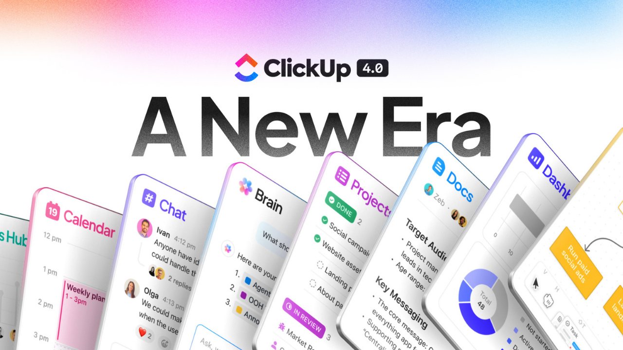
ClickUp 4.0 Review: 200+ Real Experiences vs. AI Hype

ClickUp 4.0 is now fully available to all ClickUp users.
Like iOS upgrades, that leaves a lot of people asking questions like:
- What do I need to know about ClickUp 4.0?
- How do I take advantage of the best new features?
- Why did we need a whole new ClickUp revamp?
- How do I communicate this to my team?
- What are the pricing implications?
- Where is the go-to resource for all the details on ClickUp 4.0?
And that’s precisely why I’m working through the weekend to finish up this ClickUp 4.0 review.
I want you to have free access to the best and straight-shooting playbook for ClickUp 4.0.
If you’re the kind of person who wants to grab a PDF to bookmark and work through later, you can download that here.
My Background
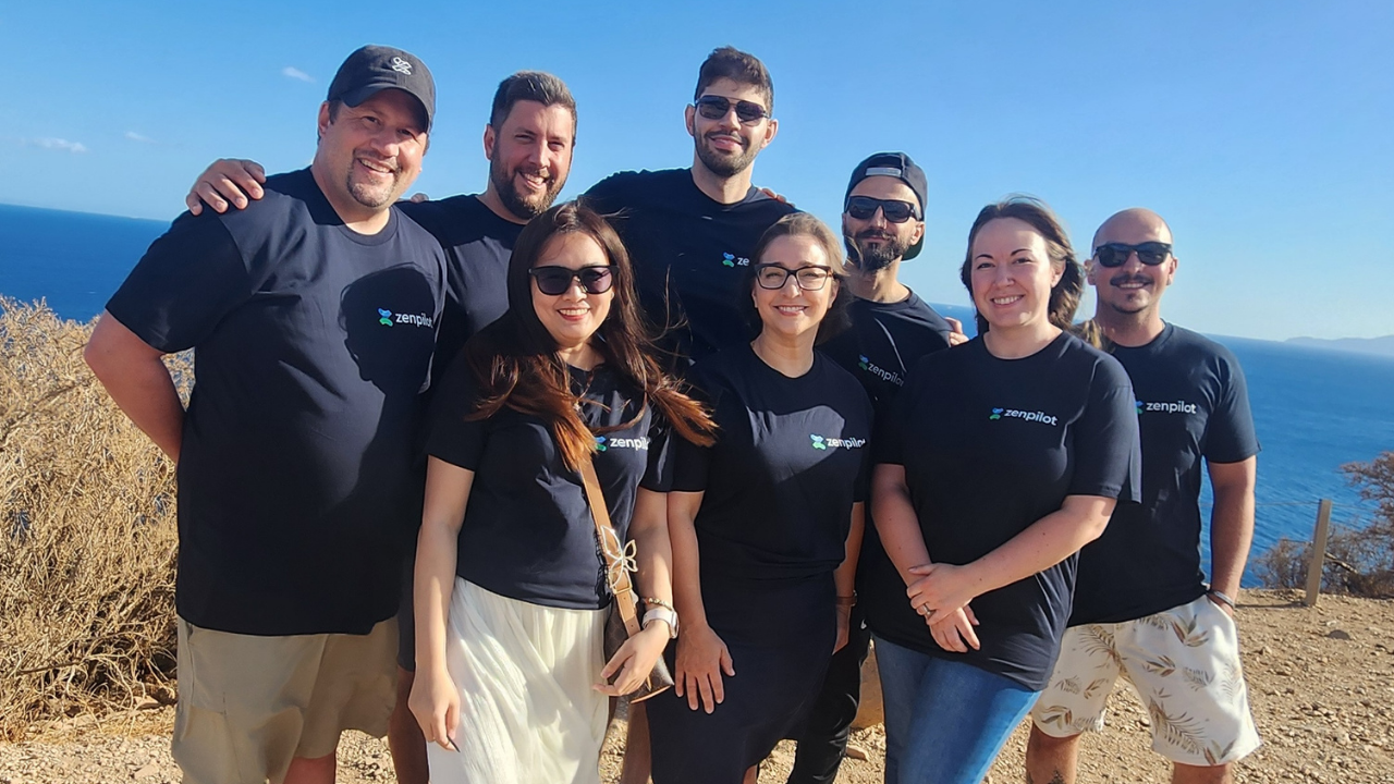
I run ZenPilot.
We’ve helped over 3,100 teams streamline their operations on ClickUp.
We’ve published the ZenPilot Methodology to help you build a more productive, profitable, and healthy team.
ZenPilot is ClickUp’s largest and highest-rated Solutions Partner. But don’t take my word for it - listen to ClickUp’s Founder & CEO Zeb Evans:
“Since becoming our first partner in 2018, ZenPilot has stood out as the go-to solution for agencies who want to get the most out of ClickUp. Their commitment to truly solving for the customer and providing the best customer experience is perfectly aligned with our mission at ClickUp - and it shows up in their results and the feedback we consistently hear about ZenPilot.”

Zeb Evans ClickUp Founder & CEO
And internally at ZenPilot, we’ve been running on ClickUp 4.0 for months and have helped dozens of customers with early access and adoption, so we’ve seen what works and clicks vs. what has a steeper learning curve.
My bias: I’m a former software founder and a lifelong early-adopter to tools - so I’m predisposed to evaluate the direction a tool is taking and be more forgiving in small details.
That’s why our client work is so important - I need to be reminded that many users are instantly turned off by minor bugs or issues.
I see a small bug and often look past it at the larger product direction - “hey, it’ll be fixed in a week or two, but this is a new way to think, I like it!” is not an uncommon reaction for me. But many users are ready to jump ship after those same experiences.
So I’ll do my best to write this ClickUp review with others in mind :)
Enough about me, let’s talk about ClickUp 4.0
The 30-Second Verdict: Is ClickUp 4.0 Actually Stable? (TL;DR)
Short answer: Yes. This is the most polished major ClickUp release I’ve seen in 8 years.
Look, I’ve been through ClickUp 1.0, 2.0, and the messy 3.0 rollout that caused real heartburn and churn. So I’m not going to sugarcoat this.
ClickUp 4.0 is a big step in the right direction. Not perfect, but really good.
They learned from 3.0’s very challenging launch. Instead of hyping it up and dropping it overnight, they gave power users months of early access. We’ve been running on it at ZenPilot since early 2025, and we’ve helped dozens of teams migrate. So most of the kinks have been worked out!
What’s Actually Working
- Teams Hub - One of the very best new features. Managers finally have visibility without micromanagement.
- Workload View - The redesign is killer. ClickUp can now legitimately compete with dedicated resource management tools like Float or Resource Guru.
- My Tasks - They finally adopted our terminology after 8 years. I couldn’t be happier (more on why this matters later)
- Fully-featured ClickUp Chat - If you’re not using Slack Connect with dozens of partners or piping in data from 20+ sources, you should seriously consider moving to ClickUp Chat.
What’s Still Clunky
- The Planner - Has so much promise (think Motion.ai), but the AI scheduling isn’t quite there yet for teams with complex workflows.
- SyncUps on mobile - Great on desktop, buggy on mobile. If you want people using this feature, ClickUp needs to fix this.
- Learning curve - Plan for 1-2 weeks of “where did everything go?” from your team.
My One Real Frustration
The “Today vs. Overdue” logic in My Tasks still bothers me. They’re doing what everyone else does (show today first, then overdue), when they should be leading the industry by showing overdue tasks first, then today, then future.
If you’re running a true due-date driven project management methodology, looking at overdue tasks after what’s due today makes zero sense. But that’s fixable. And I realize that’s a power user frustration, but hey, I’m a power user!
Bottom Line
If you’re already on ClickUp, upgrade to 4.0. As I mentioned in a recent episode of ClickUp Weekly, you’ll need to migrate here in early 2026 anyway. Use the “soft launch” settings to roll it out to yourself first, then your team in phases.
If you’re evaluating ClickUp for the first time, this is the best version of the platform they’ve ever shipped. The convergence vision - tasks, chat, docs, AI all in one place - actually works now.
Just remember: Tools, Process, Habits. ClickUp 4.0 won’t save a broken agency. But if you’ve got the process and habits in place? This is the best tool for the job.
Want the detailed breakdown? Keep reading. We’re going feature-by-feature through everything that’s new, what works, what doesn’t, and how to actually use it without losing your mind.
FAQ: Quick Answers to Common Questions
Should I upgrade to ClickUp 4.0 right now?
Yes, if you’re an existing ClickUp user. This is the most stable major release they’ve done. Start with the “soft launch” approach: enable 4.0 for yourself first, spend a few days getting comfortable, then roll it out to your team in phases.
Don’t just flip the switch for your entire workspace on a Monday morning. Give people time to adjust.
What’s the biggest improvement in ClickUp 4.0?
Teams Hub, hands down. This gives managers actual visibility into team capacity, priorities, and performance without constant check-ins. If you manage people, this alone is worth the upgrade.
Close second: the redesigned Workload View. It’s now extremely competitive with dedicated resource management tools.
Should I switch from Slack to ClickUp Chat?
Only if neither of these are true:
- You heavily use Slack Connect to message with external teams/clients in their Slack workspaces
- You’re piping in data from 20+ other tools into Slack channels
If neither applies to you and you’re already a ClickUp customer, you should absolutely look at switching. We made the move after being Slack customers for a decade, and it’s been great.
Will ClickUp 4.0 break my existing setup?
Your data and structure won’t break, but your team will need to relearn where things are. The navigation is completely different.
Expect: “Where did my Spaces go?” and “How do I find my tasks?” for the first week or two.
Action item: Update your internal SOPs and training docs. Your old screenshots and instructions now need some updates. Or chat with us and just buy your team access to the ZenPilot Training Center!
Is the AI Planner feature worth using?
The Planner has promise but isn’t there yet. If you’re a solo user or have simple workflows, it might work. For complex project management with dependencies and team coordination, it’s still clunky.
ClickUp is clearly trying to compete with Motion.ai here, and the direction is right. Just don’t expect it to magically organize your life yet.
What about mobile? I heard it’s buggy.
Desktop experience: excellent. Mobile experience: needs work, especially for SyncUps (their Slack Huddles equivalent).
If your team relies heavily on mobile for collaboration, be aware of this limitation. The core task management stuff works fine on mobile - it’s the newer collaborative features that are rough.
How long will it take my team to adjust?
1-2 weeks for most teams to get comfortable with the new navigation and interface.
Power users might adapt faster. Less technical team members might need more hand-holding.
Pro tip: Create a quick Loom video showing your team where their most-used features moved to. This will save you hours of Slack DMs.
Part I: The Philosophy & The Shift
The Era of Convergence: Why ClickUp 4.0 Exists
Let’s start with the big picture.
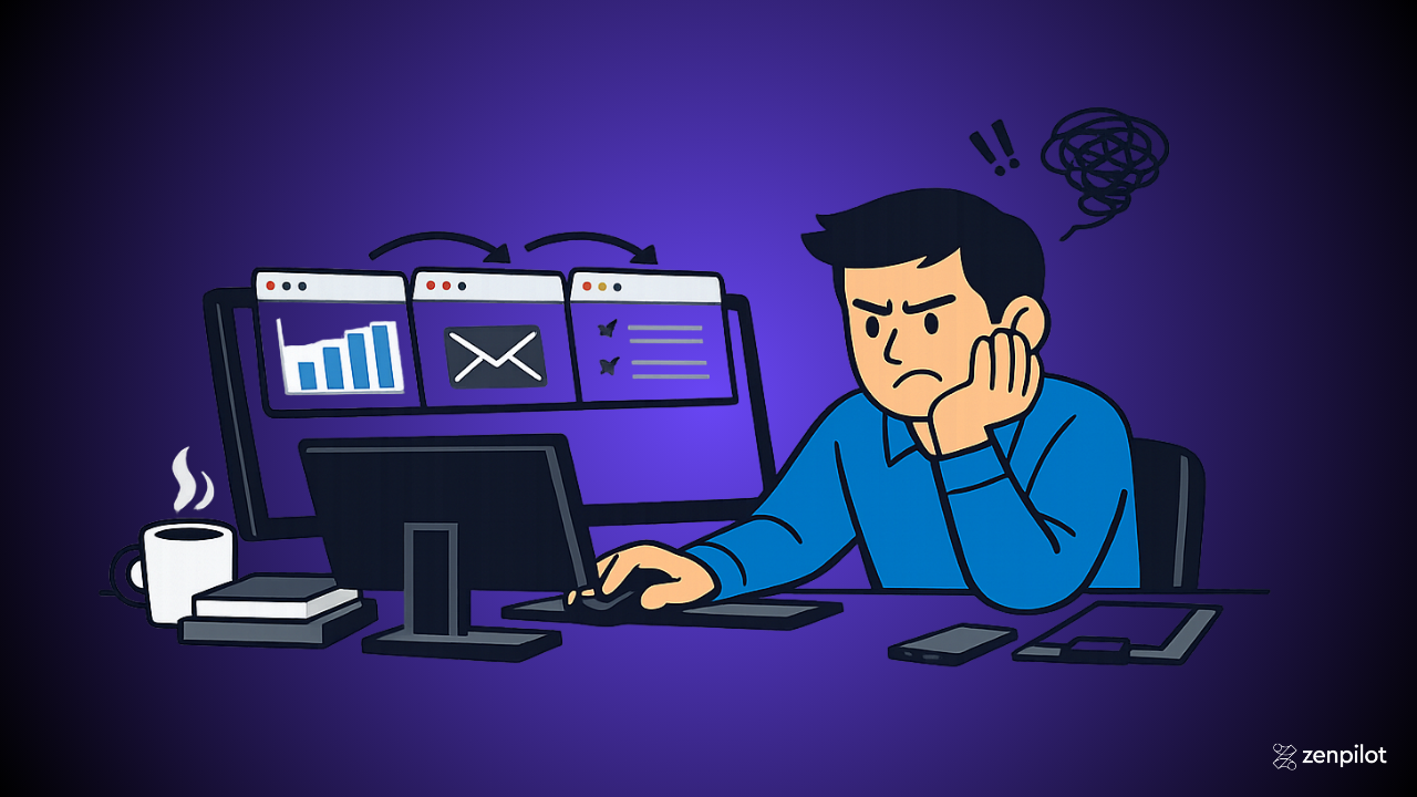
ClickUp has been talking about “one app to replace them all” since day one. For years, that felt more like marketing than reality. You’d use ClickUp for project management, Slack for chat, Google Docs for documentation, Loom for video, Calendly for scheduling, and on and on.
ClickUp 4.0 is the first time that vision actually feels achievable.
Why does this matter?
The average knowledge worker now uses 11 different applications just to get their work done. Not 11 total - 11 applications per day.
Think about your own workday. How many tabs do you have open right now? How many different tools did you check in the last hour?
- ClickUp for your tasks
- Slack for team communication
- Gmail for external communication
- Google Calendar for scheduling
- Zoom for meetings
- Loom for async video
- Google Drive or Dropbox for file storage
- HubSpot or your CRM
- Your accounting software
- Your time tracking tool
- And whatever specialized tools your service offering requires
Each one of those context switches costs you time and mental energy. And the problem is getting worse, not better.
ClickUp’s bet with 4.0 is that convergence beats best-of-breed for most teams.
Instead of having the absolute best tool for every single function, what if you had a really good tool that handled 80% of your needs in one place? The productivity gains from eliminating context switching would more than make up for the 20% you’re giving up in feature depth.
That’s the philosophy behind ClickUp 4.0. And for the first time, they’re actually delivering on it.
The “Toggle Tax”: Why Switching Apps is Costing Us $2.5 Trillion
Here’s a number that should make you realize the opportunity: $2.5 trillion.
That’s the estimated global cost of productivity lost to app switching and context fragmentation. Not billion. Trillion.
Let me break down where that number comes from, because it’s not just corporate consulting nonsense:
- 2.5 hours per day lost to context switching between different tools and tasks
- 60 minutes per day juggling between different AI tools trying to figure out which one to use for what
- 55 minutes per day just switching between apps - not even counting the mental overhead of “wait, where did I put that file?”
Add it up and the average knowledge worker is losing 4+ hours per day just to the overhead of fragmented work.
For ops leaders, this is even worse because you’re not just losing your own time - you’re losing it across your entire team.
Let’s make this personal. Say you have a team of 10 people. If each person is losing even 2 hours per day to the toggle tax, that’s 20 hours per day or 100 hours per week of productive capacity you’re bleeding.
At a $200/hour bill rate, that’s $20,000 per week in lost revenue. A million dollars annually!
And that’s conservative. Most teams that reach out to us can save more than 2 hours daily per team members.
The toggle tax shows up in subtle ways:
- You’re in ClickUp updating a task, then you have to jump to Slack to ask a question, then someone shares a Google Doc link, so now you’re in Docs, which reminds you that you need to update the project timeline, so back to ClickUp… except now you’ve forgotten what you were originally doing.
- A client emails you a question. You need to check the project status in ClickUp, the latest deliverable in Google Drive, and the conversation history in Slack before you can even respond. That “quick email reply” just took 15 minutes.
- You’re trying to plan your day, but your tasks are in ClickUp, your meetings are in Google Calendar, your client calls are in Calendly, and your personal to-dos are in a notebook. Good luck actually knowing what you should be working on right now.
This is what ClickUp 4.0 is trying to solve.
By bringing tasks, chat, docs, and AI into one unified workspace, they’re taking a real shot at eliminating the toggle tax.
Does it work perfectly? No. But it’s a heckuva a lot better than the alternative!
From “Velocity” to “Obsessive Craft”: The Pivot in ClickUp’s Product Culture
If you’ve been a ClickUp user for a while, you know their reputation: they ship fast.
Sometimes too fast.
For years, ClickUp’s product philosophy was all about velocity. They’d announce a new feature, ship it a week later, and move on to the next thing. This was exciting if you’re a product geek like me. It was also frustrating if you’re a normal human trying to run a business.
Features would ship half-baked. The UI would change without warning. Bugs would linger for months because the team was already focused on the next big thing.
The ClickUp 3.0 rollout in 2023 was the peak of this approach - and it backfired spectacularly.
They hyped it up for months, dropped it overnight with limited testing, and the product was legitimately broken for a lot of users. We had clients threatening to leave ClickUp entirely. Support was overwhelmed. The team spent months in damage control mode.
It was bad enough that it forced a genuine reckoning inside ClickUp about how they approach product development.
Enter the shift to “obsessive craft.”
Here’s what changed for ClickUp 4.0:
- Early access program - Instead of dropping 4.0 on everyone at once, they gave power users and partners (including ZenPilot) access months in advance. We’ve been running on 4.0 internally and with clients since early 2025.
- Real polish - The level of fit and finish in 4.0 is noticeably higher than previous releases. Things actually work the way you’d expect them to.
- Measured rollout - They built in “soft launch” settings that let admins test 4.0 for themselves before pushing it to their teams. Smart.
- Listening to feedback - During the beta period, they actually fixed things we reported. Novel concept.
This is what “obsessive craft” looks like in practice, and it’s paying off.
ClickUp 4.0 is the most stable major release they’ve ever done. It’s not perfect - there are still rough edges, especially on mobile. But the foundation is solid.
The velocity is still there. ClickUp still ships features faster than any other PM tool. But now there’s actually quality behind it.
If you got burned by the 3.0 rollout and swore you’d never upgrade again, I get it. But 4.0 is different. They learned their lesson.
And frankly, that makes me more bullish on ClickUp’s future than I’ve been in years.
Part II: The New Architecture (Mental Models)
Navigating the New Interface: Global Navigation vs. Sidebars
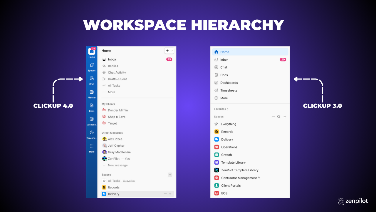
If you’ve been using ClickUp for a while, the first time you open 4.0 is going to feel… disorienting.
Everything you knew about where things are located? Mostly the same, but it seems different at first.
The old ClickUp had one sidebar on the left that did everything. Navigation, spaces, favorites, settings - it all lived in that one collapsible panel.
ClickUp 4.0 splits navigation into two distinct systems:
- Global Navigation - A vertical bar pinned to the left edge with icons for major sections (Home, Inbox, Docs, Dashboards, etc.)
- Dynamic Sidebars - Context-specific sidebars that slide in from the left or right depending on what you’re viewing
Think of the Global Nav as your app launcher. It’s always there, always visible, and clicking an icon either opens a sidebar or takes you directly to that section.
The sidebars are where the actual navigation happens. Click “Home” in the Global Nav, and you get a sidebar showing your personal workspace. Click “Spaces,” and you get a sidebar showing your team workspaces.
This is a better mental model once you internalize it, but it takes a week or two to stop looking for things in the old locations.
Pro tip for your team: Record a 3-minute Loom showing them where their 5 most-used features moved to. This will save you dozens of Slack messages.
The Death of the Legacy Sidebar: Understanding the “Global Nav”
Let’s walk through what each icon in the Global Nav does, top to bottom:
- Home - Your personal workspace. This is where “My Tasks” lives, along with your personal lists, docs, and dashboards.
- Inbox - Notifications, @mentions, assigned comments, and reminders. This used to be buried in the old UI.
- Docs - All your documents in one place. Click to open the docs sidebar.
- Dashboards - Access to all your dashboards and reporting.
- Goals - Your goals and targets (if you use this feature).
- Spaces - This is the big one. Click here to navigate to your team workspaces, client folders, and projects.
- Everything - Now called “All Tasks.” This shows every task across your entire workspace.
- Teams - The new Teams Hub. Manager’s paradise.
- Chat - ClickUp’s Slack replacement.
- Timesheets - Time tracking and reporting.
At the bottom, you’ve got your profile, settings, and workspace switcher (if you have multiple workspaces).
The key insight: most people will live in three places - Home (for personal work), Spaces (for team/client work), and Chat (for communication).
Everything else is secondary.
The “Home” Sidebar vs. “Spaces” Sidebar: Where Do I Live?
This is the #1 source of confusion for new ClickUp 4.0 users.
“Where did my Spaces go?”
“Why can’t I see my client folders?”
“How do I get back to my tasks?”
The answer comes down to understanding the difference between Home and Spaces.
Home = Personal Workspace
Home is your workspace. It shows:
- My Tasks (all tasks assigned to you across the entire workspace)
- Your personal lists (if you create any)
- Your personal docs and dashboards
- Quick access to your favorites
If you’re an individual contributor focusing on getting your work done, you can live in Home and rarely leave.
Spaces = Team Workspace
Spaces is where your team’s work lives. Click the Spaces icon and you’ll see:
- All your Spaces (typically: Growth, Delivery, Operations)
- Folders within each Space (typically: client folders or major projects)
- Lists within each Folder (typically: service lines or project phases)
If you’re a manager, project manager, or need to see the big picture across multiple projects, you’ll spend more time in Spaces.
The Rule of Thumb:
“What should I work on?” → Go to Home → My Tasks
“How’s the client project going?” → Go to Spaces → Navigate to that client’s folder
Once you internalize this distinction, the navigation actually makes a lot of sense. But yeah, it’s a mental shift.
The “Home” to “My Tasks” Revolution
For 8 years, I’ve been arguing with ClickUp about terminology.
In ClickUp 3.0, your personal task list was called “Home.” But “Home” is vague. What does that even mean? Is it my homepage? Is it where I go to see everything? Is it a dashboard?
We built the entire ZenPilot Methodology around a concept we called “My Tasks” - a filtered view showing every task assigned to you, organized by due date.
This terminology is clearer. “My Tasks” tells you exactly what you’re looking at: the tasks that are yours.
Thousands of our clients adopted this terminology. We trained their teams to say “check your My Tasks view” instead of “check Home.”
And now, finally, in ClickUp 4.0, they’ve adopted it officially.
“Home” is now called “Home” (the entire personal workspace), but within Home, your personal task list is explicitly labeled “My Tasks.”
This might seem like a small thing, but it’s huge for onboarding and adoption. New users immediately understand what “My Tasks” means. “Home” always required explanation.
The ZenPilot Validation: Why “My Tasks” Proves the Due-Date Methodology Wins
Here’s why this matters beyond just semantics.
At ZenPilot, we teach what we call a due-date methodology for task management.
The core principle: every task that needs to get done should have a due date, and your primary working view should be organized by due date.
Not by project. Not by status. Not by priority. By due date.
Why? Because that’s how time actually works.
If you organize your work by project, you end up constantly asking yourself, “What should I work on right now?” You have to make that decision fresh every time you sit down to work.
If you organize by due date, the decision is already made. Work on what’s overdue first, then what’s due today, then what’s due soon.
This eliminates decision fatigue and ensures nothing falls through the cracks.
ClickUp 4.0’s “My Tasks” view is built around this philosophy. By default, it shows:
- Overdue tasks
- Tasks due today
- Tasks due this week
- Tasks due later
(Okay, they almost got it right. More on the “Today vs. Overdue” debate later.)
The point is: ClickUp 4.0 validates what we’ve been teaching for years. A due-date-driven, “My Tasks” approach is the most effective way to manage individual workload in an agency.
Breaking Down the New Personal List and Assigned to Me Views
Within “My Tasks,” you actually have two default views:
1. Personal List
This shows tasks from your personal lists - tasks you’ve created for yourself that aren’t part of any team project. Think of this as your personal to-do list.
Most agency team members won’t use this much. The real work happens in team spaces.
2. Assigned to Me
This is the view you’ll actually use. It shows every task assigned to you across the entire workspace, regardless of which Space, Folder, or List it lives in.
By default, it’s grouped by due date and sorted chronologically. You can customize this with filters, grouping, and sorting options.
Recommended customizations:
- Add a “Time Tracked” column so you can see your progress
- Add a “Time Estimate” column to reality-check your day
- Show subtasks as expanded (so you don’t miss small work)
- Add the “Task Locations” breadcrumb so you have context on where each task lives
Once you dial in this view, save it and favorite it. This becomes your home base for daily work.
Cleaning the Hierarchy: “All Tasks” and “Subfolders”
Renaming the “Everything View” to “All Tasks”
In ClickUp 3.0, there was a view called “Everything.” It was… exactly what it sounds like. Every task in your entire workspace, all in one giant list.
Useful for admins and power users. Completely overwhelming for everyone else.
ClickUp 4.0 renames this to “All Tasks,” which is clearer and less intimidating.
Functionally, it’s the same. But the renaming is part of a broader effort to make ClickUp’s terminology more intuitive.
“Everything” sounds chaotic. “All Tasks” sounds… manageable.
Subfolders (The Christmas Gift): Finally Adding a 4th Layer of Hierarchy
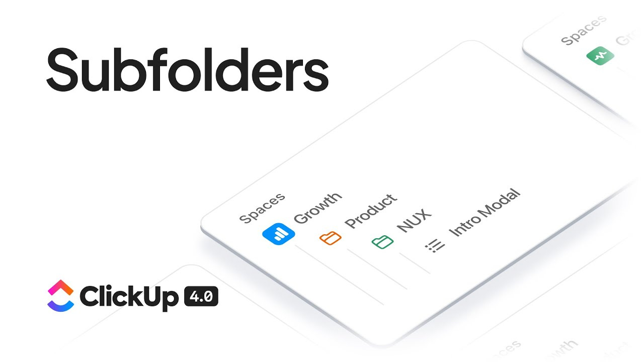
Okay, this one’s big.
For years, ClickUp’s hierarchy has been: Workspace → Spaces → Folders → Lists → Tasks → Subtasks.
This works great for most agencies. We use Spaces for business areas (Growth, Delivery, Operations), Folders for clients, and Lists for service lines or project phases.
But what if you have a large client with multiple sub-brands or business units? Or a complex project that needs further organization within a client folder?
You’ve been stuck. The hierarchy didn’t allow for it.
ClickUp 4.0 introduces Subfolders (currently in beta).
Now your hierarchy can be: Workspace → Spaces → Folders → Subfolders → Lists → Tasks → Subtasks.
This is a game-changer for agencies managing complex client relationships.
Example use case:
Let’s say you’re working with a large e-commerce brand that has 5 regional divisions. Previously, you’d have to either:
- Create 5 separate client folders (which fragments your view of the overall client relationship), or
- Cram everything into one folder with Lists doing double-duty (which gets messy fast)
With Subfolders, you can do:
- Folder: “Acme Corp”
- Subfolder: “North America Region”
- Lists: SEO, Paid Social, Email Marketing
- Subfolder: “Europe Region”
- Lists: SEO, Paid Social, Email Marketing
You get proper organizational hierarchy without fragmenting your client view.
Since this is still in beta, I’d wait a month or two before restructuring your entire workspace around it. But if you’ve been bumping up against the 3-layer limitation, Subfolders are the answer you’ve been waiting for.
Download the Complete “How to Use ClickUp” Guide
The 56-page guide from ClickUp’s #1 Solutions Partner covers everything from hierarchy design to team training.
Get Instant Access →Part III: Feature-by-Feature Deep Dive
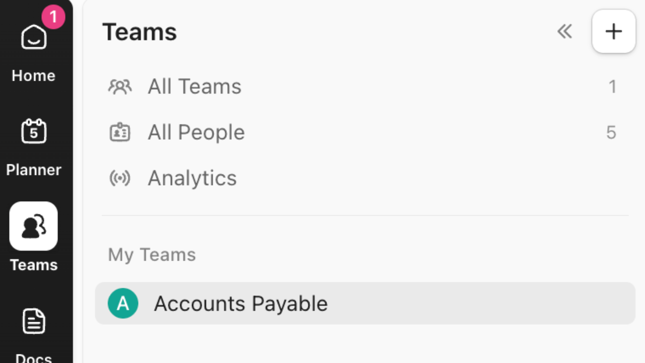
The Teams Hub: The Manager’s New Superpower
If you manage people, this is the feature you’ve been waiting for.
Teams Hub gives managers a unified view of their team’s work, capacity, and performance. No more jumping between different views, dashboards, and reports trying to piece together what’s actually happening.
Here’s what you get in Teams Hub:
- Stack-ranked priorities view - See what your team is working on, in priority order, with drag-and-drop reordering
- Capacity visualization - See who’s overloaded, who has bandwidth, and who’s at risk of burnout
- AI-powered standups - Automated status updates from your team without the manual reporting overhead
- Built-in timesheets - Time tracking and approval workflows in one place
- Team performance analytics - See completion rates, cycle times, and productivity trends
The killer feature is the capacity view. ClickUp pulls in time estimates and time tracked across all your team’s tasksand visualizes it on a timeline.
You can instantly see: “Oh, Sarah has 60 hours of work scheduled this week but only 40 hours available. I need to either reassign work or adjust deadlines.”
This visibility has always been possible in ClickUp with custom dashboards, but it required 20 minutes of dashboard setup and a degree in ClickUp-fu. Teams Hub puts it front and center with zero configuration.
The Burnout Detector: Using the Hub to Spot Capacity Red Flags
Here’s a scenario we see all the time:
A team member is consistently working late, missing deadlines, and getting snippy in Slack. The manager doesn’t notice until the team member either burns out or quits.
Teams Hub surfaces this problem before it becomes a crisis.
Look for these red flags in the capacity view:
- Consistently over-allocated - If someone has more than 40 hours of estimated work scheduled week after week, they’re drowning
- Time tracked exceeds time estimated - If someone is regularly blowing past estimates, either the estimates are wrong or the work is harder than expected
- No time off visible - If you don’t see any gaps in someone’s capacity over the next month, they’re not taking breaks
- Everything is high priority - If someone’s priority stack is all red/urgent, something is broken in your prioritization
Use Teams Hub for a weekly check-in with yourself: “Who on my team needs help this week?”
Five minutes of proactive rebalancing can prevent a month of performance issues.
What’s Missing: The Current Limitations on Custom Views
Teams Hub is great, but it’s not perfect.
The biggest limitation: you can’t create custom views within Teams Hub yet.
The views ClickUp provides are solid defaults, but every team works differently. Some teams want to see work grouped by client, others by service line, others by sprint.
Right now, you’re stuck with ClickUp’s default configurations.
This will get better. ClickUp has said custom views are on the roadmap for Teams Hub. But for now, if you need heavy customization, you’ll still need to build custom dashboards the old-fashioned way.
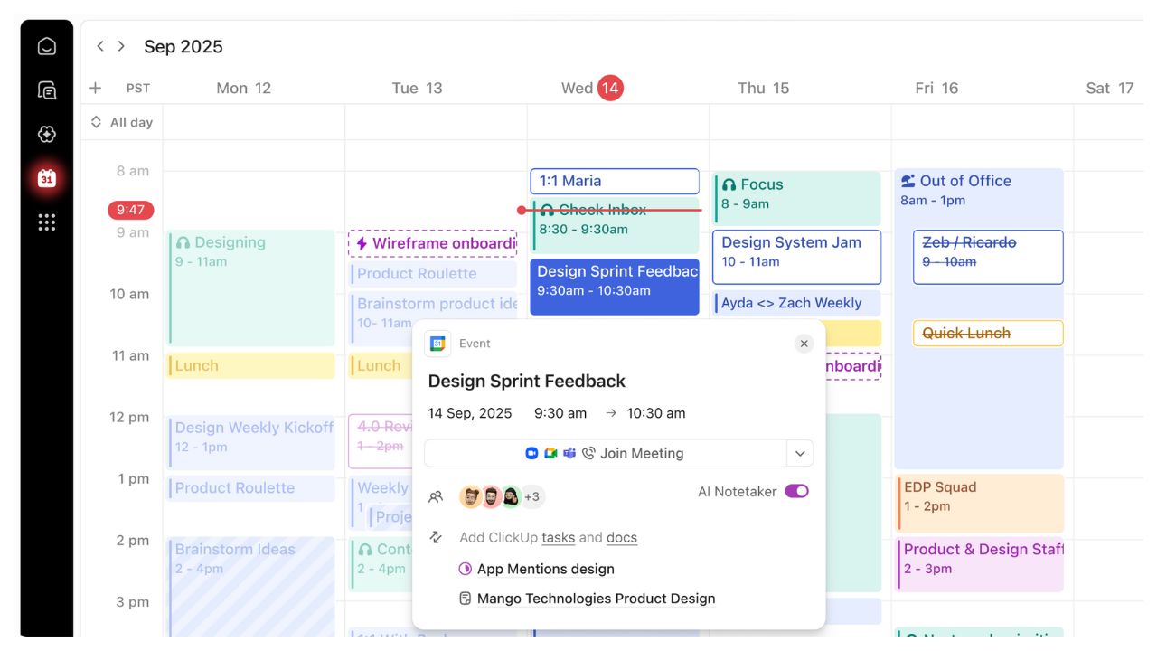
Resource Management: The Infinite Workload Canvas
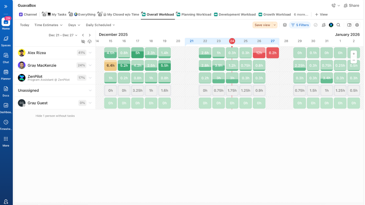
The Workload view got a massive upgrade in 4.0.
If you tried Workload in ClickUp 3.0 and hated it, give it another shot. It’s a completely different experience.
3.0 vs. 4.0: Comparing the Old Laggy Experience to the New Infinite Scroll
ClickUp 3.0’s Workload view was notoriously slow. Trying to view more than 2 weeks at a time would bring the app to its knees. Scrolling was janky. Drag-and-drop would sometimes just… not work.
It was functional enough that we’d teach clients to use it, but it required caveats: “Yeah, it’s a little slow. Just be patient with it.”
ClickUp 4.0 rebuilt Workload from scratch with a focus on performance.
Key improvements:
- Infinite horizontal scroll - View as much of the timeline as you want without performance hits
- Smooth zoom controls - Zoom from day-level detail to month-level overview with a scroll wheel
- Fast drag-and-drop - Rescheduling tasks actually works reliably now
- Better capacity calculations - See scheduled workload vs. available capacity for each team member
- Filtering that doesn’t break - Filter by team, client, priority, etc. without the view crashing
The difference is night and day. Workload is now a tool I actually want to use, not one I have to use.
Can ClickUp Finally Replace Float or Resource Guru?
We’ve had dozens of clients ask this question in the last few months.
The honest answer: for most agencies, yes.
If you’re currently paying $10-20/user/month for a dedicated resource management tool like Float, Resource Guru, or Forecast, you should seriously evaluate whether ClickUp 4.0’s Workload view can replace it.
Where ClickUp wins:
- It’s included in your existing ClickUp subscription (no additional cost)
- It pulls directly from your actual task data (no duplicate data entry)
- Changes sync instantly (move a task in Workload, it updates everywhere)
- It’s good enough for 80% of resource management use cases
Where dedicated tools still win:
- Scenario planning (“what if we hired 2 more designers?”)
- Multi-project forecasting (seeing capacity across 50+ concurrent projects)
- Client-facing views (Float has better client portal options)
- Very large teams (100+ people get harder to manage in ClickUp)
If you’re a 5-30 person agency doing standard project work, ClickUp’s Workload view is probably sufficient. Cancel the dedicated tool and put that money toward something else.
If you’re running a 100-person agency with complex forecasting needs, you might still need Float. But at least try ClickUp first.
ClickUp Chat vs. Slack: The Definitive Decision Matrix
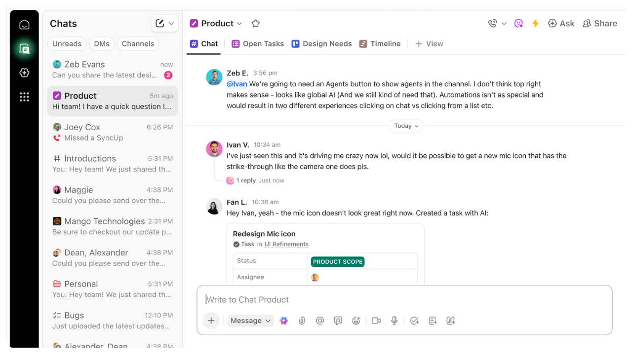
This is the question everyone’s asking: “Should we ditch Slack for ClickUp Chat?”
Let me give you the framework for making this decision.
The Case for Switching: Why Context (Tasks + Chat) Beats Standalone Messaging
The core advantage of ClickUp Chat is context.
In Slack, when someone messages you about a project, you have to:
- Read the message in Slack
- Open ClickUp to find the relevant task
- Check the task details
- Jump back to Slack to respond
In ClickUp Chat, the conversation and the task can live in the same place. You can:
- Create a task directly from a chat message
- Reference tasks inline with automatic previews
- See task status updates in your chat threads
- Convert a chat discussion into a task comment (and vice versa)
This eliminates the toggle tax.
Plus, ClickUp Chat now has feature parity with most of what teams actually use in Slack:
- Channels (public and private)
- Direct messages
- Threads
- File sharing
- Emoji reactions
- Search
- Scheduled messages (new in 4.0)
- Pinned cards for important bookmarks/notes (new in 4.0)
- Assigned comments that create action items (new in 4.0)
If you’re already paying for ClickUp and Slack, consolidating into ClickUp Chat saves you money and reduces context switching.
The Case for Staying: Slack Connect & Heavy Integrations
There are exactly two scenarios where you should keep Slack:
1. You heavily use Slack Connect
Slack Connect lets you message with external teams in their Slack workspaces. If you’re constantly collaborating with clients, partners, or contractors via Slack Connect, you’re stuck with Slack.
ClickUp Chat doesn’t have an equivalent feature (and probably never will).
2. You’re piping data from 20+ tools into Slack
Some teams use Slack as a notification hub, with automated alerts from Stripe, HubSpot, Databox, Google Analytics, and a dozen other tools all flowing into Slack channels.
ClickUp Chat has integrations, but they’re not as extensive as Slack’s. If you’ve built a complex notification system in Slack, replicating it in ClickUp Chat would be painful.
For everyone else: consider the switch.
We made the move at ZenPilot after being on Slack for 10+ years. It took about 2 weeks for the team to adjust, and now we’re happier without the constant tab-switching.
New Chat Features: Scheduled Messages, Pinned Cards, and Assigned Comments
ClickUp 4.0 added three features to Chat that make it more competitive with Slack:
Scheduled Messages - Write a message now, schedule it to send later. Great for async work across timezones.
Pinned Cards - Create persistent notes, bookmarks, or widgets that stay at the top of a channel. Think of it like Slack’s pinned messages, but more flexible.
Assigned Comments - Convert any chat message into an actionable to-do by assigning it to someone. This creates a task-like object without leaving chat.
These are small features, but they add up. ClickUp is clearly studying Slack and Slack is clearly studying ClickUp. Eventually they’ll converge on the same feature set, but ClickUp has the advantage of built-in task management.
The Planner & AI Scheduling: Hype vs. Reality
Okay, let’s talk about the Planner.
This is the most hyped feature in ClickUp 4.0, and it’s… fine.
Not bad. Not amazing. Fine.
Is This a “Motion” Killer? (Expectation vs. Execution)
ClickUp is clearly trying to compete with Motion, Reclaim, and other AI scheduling tools.
The pitch: “Let ClickUp automatically schedule your tasks into your calendar based on due dates, priorities, and your availability.”
In theory, this is great. In practice, it’s clunky for anyone with complex workflows.
Where the Planner works well:
- Solo users with relatively straightforward task lists
- Teams with predictable, repeatable work
- People who want a “suggested schedule” but not strict automation
Where the Planner falls short:
- Multi-person projects with dependencies (AI doesn’t understand blockers well)
- Unpredictable agency work (client emergencies break the schedule immediately)
- Teams with high meeting loads (AI scheduling conflicts with calendar reality)
Motion is still better if AI scheduling is your primary use case. But Motion costs $34/user/month on top of your PM tool.
ClickUp’s Planner is free (included in your subscription), and it’s getting better every month.
Best Use Cases for the Planner Right Now
Don’t write off the Planner entirely. It works well for specific scenarios:
Morning planning ritual - Open the Planner at the start of your day, see ClickUp’s suggested schedule, adjust as needed, then work from that plan.
Personal admin tasks - Use it for your internal to-dos (expense reports, 1-on-1 prep, etc.) where the stakes are lower.
Rough capacity check - Even if you don’t follow the AI schedule, the Planner gives you a reality check on whether you’ve over-committed.
Just don’t expect it to magically organize your entire life. It’s a planning aid, not a planning replacement.
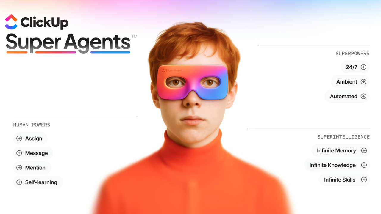
For a deeper look at ClickUp’s full AI capabilities - including Brain, Super Agents, and how to actually get value from them - check out our complete ClickUp AI guide.
The “Hidden Gems”
Not everything in ClickUp 4.0 got splashy announcement blog posts. Here are two underrated features that will make your life easier:
Task Type Custom Fields: Cleaning Up the UI Clutter
Custom Fields are one of ClickUp’s most powerful features, but they can quickly create UI clutter.
If you have 15 custom fields defined at the Space level, every single task shows all 15 fields - even if most of them aren’t relevant for that particular task.
ClickUp 4.0 introduces Custom Fields by Task Type.
Now you can scope custom fields to specific task types. For example:
- Task Type: “Blog Post” → Show custom fields for Word Count, Target Keyword, Publication Date
- Task Type: “Design Asset” → Show custom fields for Dimensions, File Format, Brand Guidelines
- Task Type: “Client Meeting” → Show custom fields for Meeting Type, Attendees, Recording Link
This keeps the UI clean and ensures people only see the fields relevant to their work.
To set this up: Create your Task Types, then when you’re adding custom fields, choose “Add to specific task types” instead of “Add to entire space.”
The New Universal Search
Search got a major upgrade in 4.0, and it’s genuinely impressive.
Previously, ClickUp’s search was… okay. It worked, but it wasn’t fast, and the results weren’t always relevant.
The new Universal Search (press Cmd+K or Ctrl+K) is:
- Faster - Results appear as you type with minimal lag
- Smarter - Better relevance ranking and fuzzy matching
- More comprehensive - Searches tasks, docs, comments, dashboards, and even chat messages
- Contextual - Shows task breadcrumbs so you know where things live
This seems like table stakes, but good search is surprisingly rare in PM tools. ClickUp finally nailed it.
Pro tip: Teach your team to use Cmd+K as their primary navigation method. It’s often faster than clicking through the sidebar.
Part IV: The Real User Experience (The “Gotchas”)
The “Today vs. Overdue” Logic Debate
Alright, I need to get this off my chest.
This is my one real frustration with ClickUp 4.0, and it’s a design choice I fundamentally disagree with.
The Issue: Why 4.0 Hides Overdue Tasks Below “Today”
In the “My Tasks” view, ClickUp 4.0 shows your tasks in this order by default:
- Tasks due Today
- Tasks due This Week
- Tasks due Later
- Overdue tasks
Did you catch that?
Overdue tasks are shown LAST.
This is the same logic most task management tools use (Asana, Todoist, etc.), and it drives me crazy.
Here’s why it’s wrong:
If a task is overdue, it means the deadline has already passed. By definition, it should be more urgent than something due today. Yet ClickUp is showing you today’s tasks first and making you scroll down to see the overdue work.
This creates a dangerous pattern where overdue tasks become invisible. You focus on what’s due today, check those boxes, and feel productive - meanwhile, the overdue tasks are piling up below the fold.
The ZenPilot Take: Why Strict Due-Date Methodologies Suffer Here
In the ZenPilot Methodology, we teach a strict order of operations:
- Work on overdue tasks FIRST
- Then work on tasks due today
- Then work on tasks due later
This ensures nothing falls through the cracks. If something is overdue, it gets immediate attention - not hidden at the bottom of your list.
ClickUp’s default ordering breaks this methodology.
I understand why they made this choice. Most users think of “today” as the most urgent timeframe, so showing today’s tasks first feels intuitive.
But if you’re running a true due-date-driven system (like we teach), this logic is backwards.
The Fix: How to Hack Your Mental Model (or Your View) to Handle It
Fortunately, you can work around this.
Option 1: Customize your view
In your “My Tasks” view, change the grouping to show Overdue first:
- Click the “Group by” dropdown
- Select “Due Date”
- In the grouping options, drag “Overdue” to the top
- Save this as your default view
Now your tasks will show in the correct order: Overdue → Today → This Week → Later.
Option 2: Train your team to check Overdue first
If you can’t customize the view (maybe you don’t have admin permissions), train yourself to scroll down and check the Overdue section before looking at Today.
Make it a habit: “Every morning, I check Overdue first, then Today.”
It’s a mental model hack, but it works.
My hope is that ClickUp will eventually let users choose their preferred default ordering. Until then, you need to be intentional about this.
Mobile Friction: The SyncUp Struggle
Great on Desktop, Buggy on Mobile: Managing Expectations for “Huddles”
ClickUp 4.0 introduced SyncUps - their answer to Slack Huddles. It’s a quick audio/video call feature built directly into ClickUp.
On desktop, it works great. Click the SyncUp button, start talking, share your screen if needed, hang up when you’re done. Simple.
On mobile, it’s a mess.
We’ve seen:
- Audio quality issues (choppy, dropping out)
- Connection problems (fails to connect, disconnects randomly)
- UI bugs (buttons don’t respond, screen freezes)
- Notification issues (doesn’t alert you when someone starts a SyncUp)
If your team does a lot of quick mobile collaboration (e.g., you’re a field services agency, or your team works remotely without consistent desk access), don’t rely on SyncUps yet.
Stick with Zoom, Google Meet, or whatever you’re currently using for mobile calls until ClickUp fixes this.
For desktop-first teams, SyncUps are solid and eliminate the need to open a separate video call tool for quick syncs.
The Learning Curve
The “Where Did My Spaces Go?” Confusion
This is the #1 support question we get from clients after they upgrade to 4.0.
“I can’t find my Spaces. Where did everything go?”
The answer: Spaces didn’t go anywhere. They’re just in a different location.
In ClickUp 3.0, Spaces were always visible in the left sidebar. You’d see a list of all your Spaces as soon as you opened ClickUp.
In ClickUp 4.0, Spaces are tucked inside the Global Nav. You need to click the “Spaces” icon (looks like a stack of squares) to see your Spaces list.
This is more efficient from a UI perspective (less clutter), but it’s disorienting for users who are used to always seeing their Spaces.
How to help your team:
Create a 2-minute Loom that shows:
- Click the “Spaces” icon in the Global Nav (on the left)
- See the Spaces sidebar appear
- Click into any Space to see your Folders and Lists
- Favorite your most-used Spaces so they’re easily accessible
Send that video to your team on day one of the 4.0 rollout. It will save you dozens of confused Slack messages.
Why the Planner is “Clunky” for Complex Project Management
I already covered the Planner’s limitations earlier, but it’s worth reiterating here in the “gotchas” section.
The Planner is great for personal task management and simple workflows. It falls apart for complex, multi-person projects.
Specific pain points we’ve seen with clients:
- The AI doesn’t understand task dependencies well (it might schedule Task B before Task A, even though A blocks B)
- It doesn’t account for team members’ actual availability (meetings, time off, other commitments)
- It can’t handle projects with external dependencies (waiting on client feedback, vendor deliverables, etc.)
- The suggested schedule is often wildly optimistic about how much work can fit in a day
If you’re managing complex agency projects, don’t rely on the Planner as your primary planning tool. Use it as a supplement to manual planning, not a replacement.
Part V: The ZenPilot Strategy & Verdict
The Upgrade Strategy: How to Migrate Without Chaos
You’re convinced. You want to upgrade to ClickUp 4.0.
Great. Now let’s make sure you don’t screw it up.
The “Soft Launch” Protocol: Using Personal Rollout Settings First
ClickUp 4.0 has a feature called “Personal Rollout” that lets workspace admins test 4.0 for themselves before rolling it out to the entire team.
Use it.
Here’s the rollout strategy we recommend:
Week 1: Admin testing
- Workspace admin enables 4.0 for themselves only
- Spend 3-5 days using 4.0 for real work (not just clicking around)
- Identify the 5-10 most confusing changes
- Create a FAQ doc or Loom video addressing these pain points
Week 2: Pilot group
- Enable 4.0 for 2-3 power users (people who are generally positive and tech-savvy)
- Have them use it for a full week
- Gather feedback and refine your training materials
- Identify any major blockers that need to be addressed before wider rollout
Week 3: Full rollout
- Enable 4.0 for the entire team
- Send out your training materials (FAQ doc, Loom videos, etc.)
- Host a 30-minute live Q&A where people can ask questions
- Be available in Slack/Chat for the first few days to handle confusion
Week 4: Check-ins
- Schedule 1-on-1s with each team member
- Ask: “What’s working? What’s confusing? What do you miss from 3.0?”
- Make adjustments based on feedback
This measured approach prevents the chaos of a sudden overnight switch.
Yes, it takes a month instead of a day. But you’ll have way fewer frustrated team members and way less productivity loss.
Why Your Internal SOPs Are Now Obsolete
If you have documented processes for how your team uses ClickUp (and you should), they’re now out of date.
Every screenshot showing the old sidebar? Obsolete.
Every instruction saying “Go to Home” instead of “Go to My Tasks”? Obsolete.
Every Loom walking through the old Workload view? Obsolete.
This is the hidden cost of the 4.0 upgrade. It’s not just learning the new interface - it’s updating all your documentation.
Action items for your ClickUp Champion:
- Audit all internal SOPs and training docs
- Identify which ones reference ClickUp-specific instructions
- Update screenshots and instructions for 4.0
- Re-record any Loom videos that show the old interface
Budget 5-10 hours for this work. It’s tedious, but necessary.
If you skip this step, new team members will get confused by your outdated docs, and adoption will suffer.
Final Verdict: The Success Triangle
Tools vs. Process vs. Habits: Why 4.0 Won’t Save a Broken Agency
I’m going to say something that might sound contradictory after 6,000+ words singing ClickUp’s praises:
ClickUp 4.0 will not fix your agency’s problems.
Neither will Asana, Monday, Notion, or any other tool.
At ZenPilot, we teach something called the Success Triangle:
- Tools - The software you use (ClickUp, Slack, etc.)
- Process - Your documented workflows and methodologies
- Habits - The daily behaviors your team actually follows
All three need to be in place for your operations to work.
If you have great tools but no documented processes, everyone uses the tools differently and nothing is consistent.
If you have great processes but bad tools, execution is painful and slow.
If you have great tools and processes but your team doesn’t follow them, nothing happens.
ClickUp 4.0 is an excellent tool - probably the best project management platform for agencies right now. But it’s only one leg of the triangle.
If you’re struggling with missed deadlines, unclear client communication, or team burnout, upgrading to ClickUp 4.0 might help. But it won’t solve the underlying process or habit issues.
Fix your processes. Train your team. Build healthy habits. Then leverage ClickUp 4.0 to execute those processes faster and better.
The ZenPilot Scorecard: Speed, Stability, Mobile, and Features
If you’ve made it this far, you deserve a quick summary scorecard.
Here’s how I’d rate ClickUp 4.0 on the dimensions that matter most for agencies:
Speed: 9/10
ClickUp 4.0 is noticeably faster than 3.0, especially in views like Workload and Dashboards. The new architecture feels snappy and responsive. Occasional lag when loading large datasets, but overall excellent.
Stability: 9/10
This is the most stable major ClickUp release I’ve seen in 8 years. The early access program paid off. There are still bugs (mostly minor UI issues), but nothing that breaks core functionality.
Mobile: 6/10
The mobile experience lags significantly behind desktop. Core task management works fine, but newer features like SyncUps are buggy. If your team is heavily mobile-dependent, this is a real limitation.
Features: 9/10
Teams Hub, the redesigned Workload view, improved Chat, and countless smaller improvements make 4.0 the most feature-complete version of ClickUp yet. The Planner needs work, but everything else is excellent.
Overall: 8.5/10
ClickUp 4.0 is the best version of the platform they’ve ever shipped. It’s not perfect - mobile needs work, the Planner is overhyped, and the Today/Overdue logic bugs me. But the wins far outweigh the misses.
If you’re already on ClickUp, upgrade. If you’re evaluating PM tools, ClickUp 4.0 should be at the top of your list.
Next Steps
Watch “ClickUp Weekly” (Launching January 2026)
ClickUp changes fast. Like, really fast.
That’s why we’re launching ClickUp Weekly - a video series covering the latest ClickUp updates, tips, and best practices specifically for agencies.
Every week, we’ll break down:
- New features and how to actually use them
- Updates to existing functionality
- Agency-specific use cases and workflows
- Answers to common questions we’re hearing from clients
Subscribe now so you don’t miss the launch.